library(tidyverse)
library(ggtext)
library(SIBER)I never published the code associated with this Archaeological and Anthropological Sciences article, but you can find the raw data here. At the time, my R data visualization skills weren’t able to produce what I was envisioning. Things have changed!
I used to export figures from R into Adobe Illustrator. I have since abandoned this practice, because I was spending way too much time editing figures when I made any small adjustment to the original exported file. I now ensure all my data visualizations are reproducible. I’ll walk you through reproducing the graph I made in Illustrator using ggplot2.
Libraries
Load Data
mydata <- read.table("Risk_Stability_SIBER_New.txt", header = T)


as_tibble(mydata)
# A tibble: 79 × 4
iso1 iso2 group community
<dbl> <dbl> <int> <int>
1 -17.2 8.4 1 1
2 -15.6 9.7 1 1
3 -22.5 3.9 1 1
4 -16.6 8.2 1 1
5 -17.3 9.3 1 1
6 -16.1 7.4 1 1
7 -19 4.7 1 1
8 -17.2 9 1 1
9 -15.9 9.8 2 1
10 -15.8 8.8 2 1
# … with 69 more rowsSIBER plot
First, let’s check out the original graph that I exported from R using SIBER. If you’ve never heard of SIBER, it is a fantastic tool for analyzing and summarizing stable isotope data. Check out the original article by Jackson et al. (2011).
siber.example <- createSiberObject(mydata)

community.hulls.args <- list(col = 1, lty = 1, lwd = 1)
group.ellipses.args  <- list(n = 100, p.interval = 0.40, lty = 1, lwd = 2)
group.hull.args      <- list(lty = 2, col = "grey20")

plotSiberObject(siber.example,
                ax.pad = 2,
                hulls = F, community.hulls.args,
                ellipses = F, group.ellipses.args,
                group.hulls = F, group.hull.args,
                bty = "L",
                iso.order = c(1,2),
                xlab=expression({delta}^13*C~'\u2030'),
                ylab=expression({delta}^15*N~'\u2030'),
                x.limits = c(-26, -10.0),
                y.limits = NULL,
                cex = 1.5,
                cex.axis = 1.5,
                cex.lab = 1.5,
                col.axis = "gray29",
                col.lab = "gray29"
)

plotGroupEllipses(siber.example, n = 100, p.interval = 0.40, small.sample = TRUE,
                    lty = 1, lwd = 3)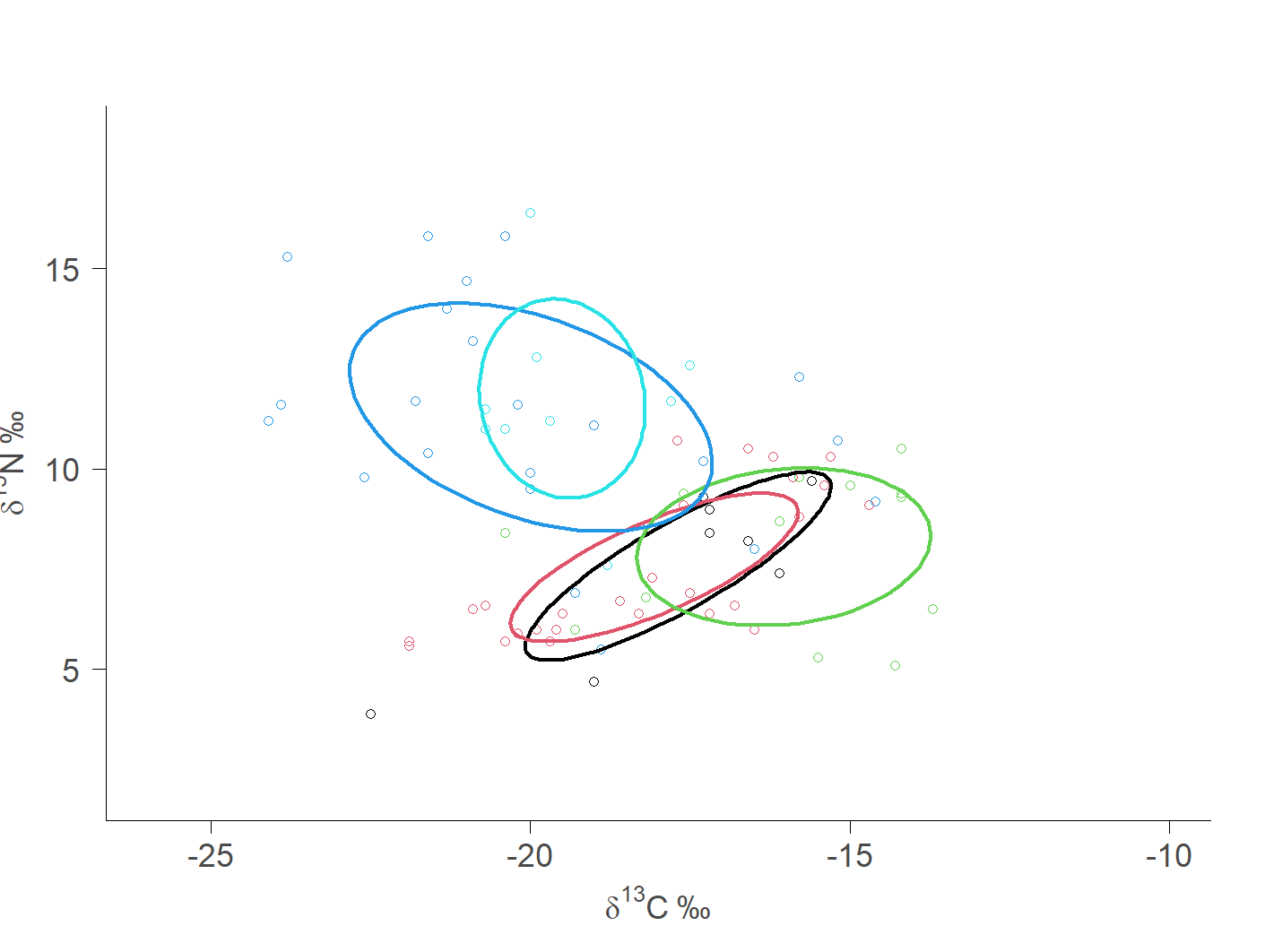
Final Illustrator Plot
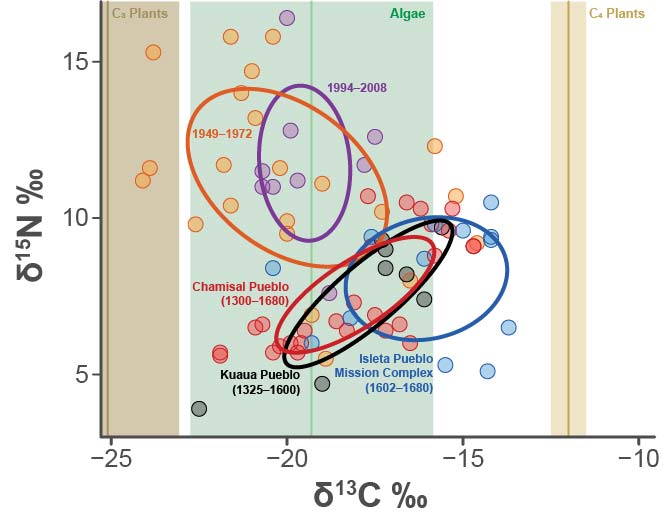
Now, look at all the work that I did to this graph in Illustrator for the final published version. It looks good (if I do say so myself). BUT if I change anything fundamental to the graph I have to re-do everything. That’s unacceptable. So, let’s try to reproduce this in ggplot2.
Oof… We’ve got a problem.
ggplot2 has a nice function called stat_ellipse() that will plot confidence ellipses for you. However, the package SIBER calculates ellipses a little differently. Compare the below plot to the above plot. You can see, for instance, that the standard ellipses (comprising about 40% of the data) for Kuaua and Isleta are in a different positions. This is because SIBER does an excellent job calculating ellipses for small sample sizes, which is the reason we’re getting different results. So, now the question becomes: how can we take the geometry from SIBER and get it into ggplot2. Luckily, there is a fantastic function called siberKapow() that can help us accomplish this task!
mydata %>%
  mutate(group = factor(group)) %>%
  ggplot(aes(x = iso1, y = iso2,
           group = group, fill = group, color = group)) +
  geom_point() +
  stat_ellipse(level = 0.40) +
  theme_bw()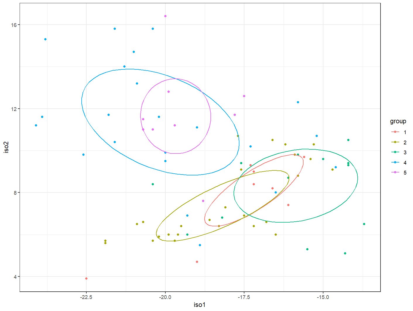
Kapow!
We can extract the ellipse geometry straight from SIBER into an object of class owin using siberKapow().
mydata$group <- factor(mydata$group)

ellipse_mydata <- siberKapow(mydata, isoNames = c("iso1", "iso2"),
                             group = "group", pEll = 0.40)
Let’s Create the Final Plot
But first we need to manually set our group colors.
colors <- c("#000000", "#cb2027", "#265dab", "#df5c24", "#7b3a96")

fills <- c("#000000", "#cb2027", "#265dab", "#df5c24", "#7b3a96")
Now let’s make the plot.
ggplot(ellipse_mydata$ell.coords, aes(x = X1, y = X2, fill = group,
                                      color = group)) +
  annotate(geom = "rect", xmin = -22.7, xmax = -15.8, ymin = -Inf, ymax = Inf,
           fill = "#adcfb7", alpha = 0.60) +
  annotate(geom = "rect", xmin = -12.5, xmax = -11.5, ymin = -Inf, ymax = Inf,
           fill = "#e5d3a1", alpha = 0.60) +
  annotate(geom = "rect", xmin = -Inf, xmax = -23, ymin = -Inf, ymax = Inf,
           fill = "#9e884a", alpha = 0.45) +
  geom_vline(xintercept = -19.3, color = "#90cd97", size = 2,
             linetype = "solid") +
  geom_vline(xintercept = -24.8, color = "#a29261", size = 2,
             linetype = "solid") +
  geom_vline(xintercept = -12, color = "#bfa554", size = 2,
             linetype = "solid") +
  geom_point(mydata, mapping = aes(x = iso1, y = iso2), shape = 21, size = 7,
             fill = NA, stroke = 1.5) +
  geom_point(mydata, mapping = aes(x = iso1, y = iso2), size = 7, alpha = 0.5) +
  geom_polygon(alpha = 0, size = 2) +
  scale_color_manual(values = colors) +
  scale_fill_manual(values = fills) +
  labs(x = "δ<sup>13</sup>C (‰)",
       y = "δ<sup>15</sup>N (‰)") +
  xlim(-25, -10) +
  ylim(3, 17) +
  theme_classic() +
  theme(legend.position = "none",
        axis.line = element_line(color = "#4d4d4d", size = 1.5),
        axis.text.x = element_text(color = "#4d4d4d", size = 25),
        axis.text.y = element_text(color = "#4d4d4d", size = 25),
        axis.title.x = element_markdown(color = "#4d4d4d", size = 35,
                                    face = "bold"),
        axis.title.y = element_markdown(color = "#4d4d4d", size = 35,
                                    face = "bold"),
        axis.ticks.x = element_line(color = "#4d4d4d", size = 1.5),
        axis.ticks.y = element_line(color = "#4d4d4d", size = 1.5),
        axis.ticks.length = unit(5.9, "pt")) +
  annotate(geom = "text", x = -22.75, y = 12.5, label = "1949–1972",
           color = "#df5c24", fontface = "bold",
             hjust = "left", size = 12/.pt) +
  annotate(geom = "text", x = -18.75, y = 14, label = "1994–2008",
           color = "#7b3a96", fontface = "bold",
             hjust = "left", size = 12/.pt) +
  annotate(geom = "text", x = -20.10, y = 7.5,
           label = "Chamisal Pueblo\n(1300–1680)", color = "#cb2027",
           fontface = "bold", hjust = "right", size = 12/.pt) +
  annotate(geom = "text", x = -20, y = 4.8,
           label = "Kuaua Pueblo\n(1325–1600)", color = "#000000",
             fontface = "bold", hjust = "right", size = 12/.pt) +
  annotate(geom = "text", x = -15.80, y = 4.75,
           label = "Isleta Pueblo\nMission Complex\n(1602–1680)",
           color = "#265dab", fontface = "bold", hjust = "right",
           size = 12/.pt) +
  annotate(geom = "richtext", x = -11.40, y = 17,
           label = "C<sub>4</sub> Plants", color = "#bfa554", fontface = "bold",
           fill = NA, label.size = NA, hjust = 0, vjust = 1, size = 13/.pt) +
  annotate(geom = "richtext", x = -24.70, y = 17,
           label = "C<sub>3</sub> Plants", color = "#a29261", fontface = "bold",
           fill = NA, label.size = NA, hjust = 0, vjust = 1, size = 13/.pt) +
  annotate(geom = "text", x = -16.0, y = 17, label = "Algae", color = "#059748",
           fontface = "bold", hjust = 1, vjust = 1, size = 13/.pt)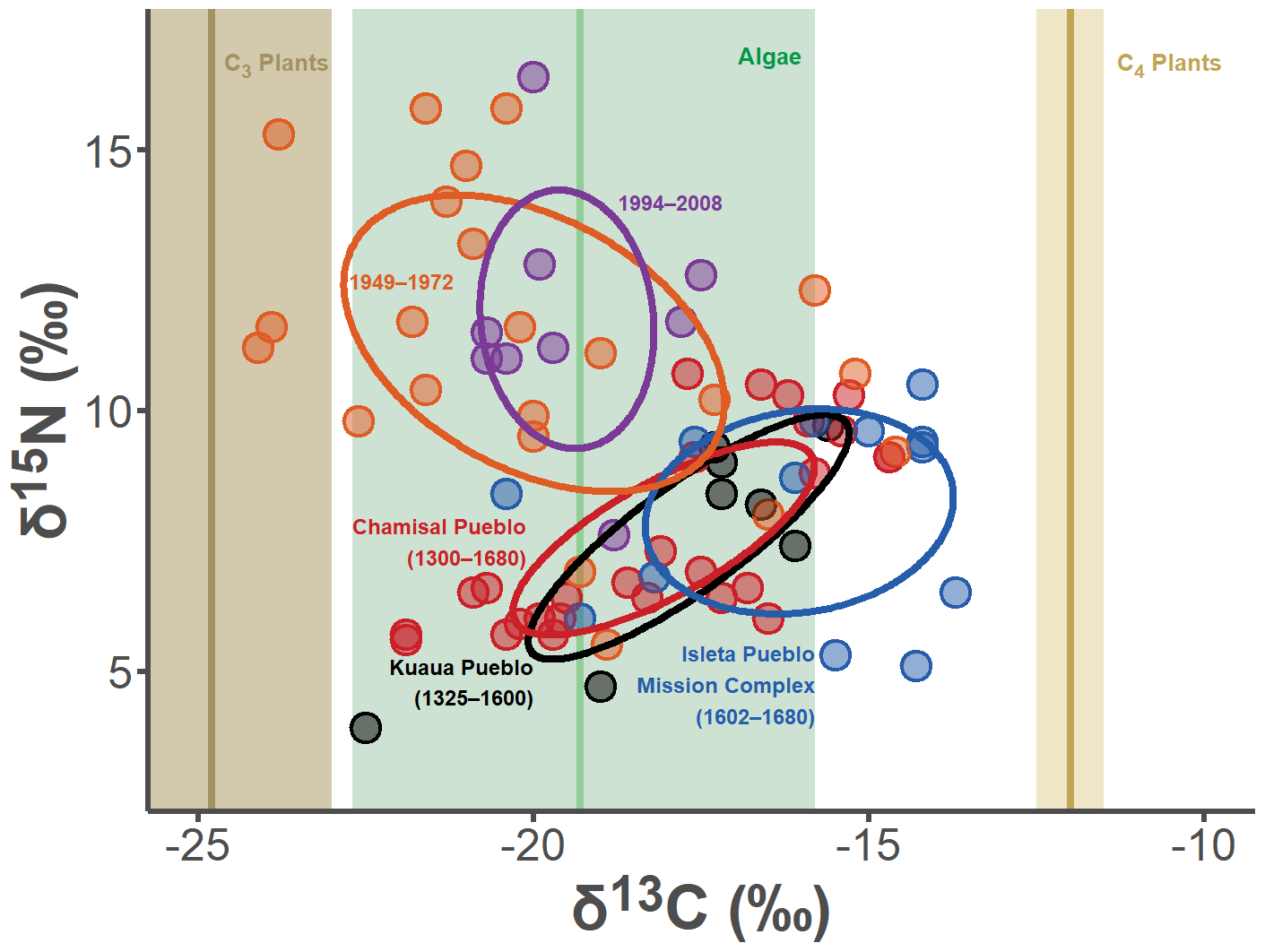
Welp… I think we did a pretty good job at replicating the Illustrator plot. The gist of this whole exercise is: if you just spend a little bit of extra time at the beginning of a project getting your visualizations “publication ready,” then you can effortlessly re-create those images throughout the life of your project. I find this so incredibly helpful, as I can instantaneously update hi-res figures in real time for presentations, etc.